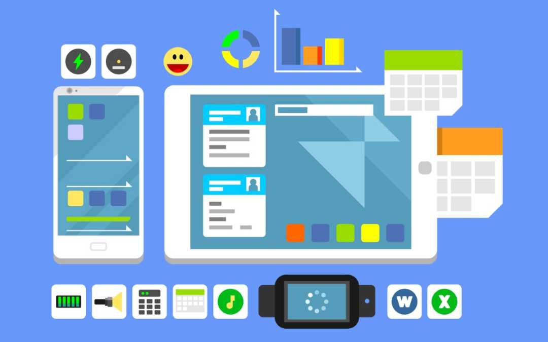
Web Design for Different Devices: Desktop, Tablet, and Mobile
In today’s digital landscape, web design is more crucial than ever. With the increasing variety of devices used to access the internet, it is essential to create websites that provide a seamless user experience across all platforms. This guide will explore the principles of responsive web design and how to optimize your website for desktop, tablet, and mobile devices.
Understanding Responsive Web Design
Responsive web design (RWD) is an approach that ensures your website adapts to different screen sizes and orientations. This technique enhances usability and accessibility, making it easier for users to navigate your site regardless of the device they are using. Here are some key principles of responsive web design:
- Fluid Grids: Use relative units like percentages instead of fixed units like pixels to create a flexible layout.
- Flexible Images: Ensure images resize within their containing elements to prevent overflow and maintain aspect ratios.
- Media Queries: Utilize CSS media queries to apply different styles based on the device’s characteristics, such as width, height, and resolution.
Designing for Desktop Devices
When designing for desktop devices, you have the advantage of larger screens, which allows for more complex layouts and detailed content. Here are some tips for optimizing your desktop web design:
1. Utilize Space Wisely
Desktop screens offer ample space, but it’s essential to avoid clutter. Use whitespace effectively to create a clean and organized layout. This helps users focus on key elements without feeling overwhelmed.
2. Navigation Menus
Desktop users typically expect to see a comprehensive navigation menu. Consider using dropdown menus or sidebars to display additional options without overwhelming the main interface. Ensure that your navigation is intuitive and easy to use.
3. High-Quality Visuals
With larger screens, high-resolution images and videos can significantly enhance the user experience. Invest in quality visuals that align with your brand and content, ensuring they load quickly to avoid frustrating users.
Designing for Tablet Devices
Tablets bridge the gap between desktop and mobile devices, offering a unique user experience. Here’s how to optimize your design for tablets:
1. Touch-Friendly Interfaces
Tablets are primarily touch-operated, so ensure that buttons and interactive elements are large enough to be easily tapped. Aim for a minimum target size of 44×44 pixels to enhance usability.
2. Simplified Navigation
While tablets have more screen real estate than mobile devices, users still prefer simplified navigation. Consider using a collapsible menu or a hamburger icon to save space while providing easy access to essential links.
3. Adjust Content Layout
Content should be displayed in a single-column layout for tablets to facilitate scrolling. Avoid side-by-side elements that may require horizontal scrolling, as this can lead to a frustrating user experience.
Designing for Mobile Devices
Mobile devices have become the primary means of accessing the internet for many users. Therefore, optimizing your website for mobile is crucial. Here are some strategies to consider:
1. Prioritize Content
Mobile screens are smaller, so prioritize your content. Focus on the most important information and features, ensuring that users can easily find what they need without excessive scrolling.
2. Optimize Loading Speed
Mobile users often rely on cellular data, making loading speed critical. Optimize images, minimize code, and leverage browser caching to ensure your site loads quickly on mobile devices.
3. Use Mobile-Friendly Forms
If your website includes forms, make them mobile-friendly. Use larger input fields, reduce the number of required fields, and implement auto-fill features to enhance the user experience.
Testing and Iteration
Once you have designed your website for different devices, it’s essential to test it thoroughly. Use tools like Google’s Mobile-Friendly Test and BrowserStack to check how your site performs across various devices and browsers. Gather feedback from real users to identify areas for improvement and iterate on your design accordingly.
Conclusion
In conclusion, designing for different devices—desktop, tablet, and mobile—requires a thoughtful approach to ensure a seamless user experience. By implementing responsive web design principles, prioritizing content, and optimizing for speed, you can create a website that meets the needs of all users. Remember, the key to successful web design is continuous testing and iteration, so stay updated with the latest trends and technologies to keep your site relevant and user-friendly.


